I walked into this exhibit ready to geek out. I walked out feeling like I’d been in a master class on how art carries culture, resists authority, and quietly reshapes who we believe deserves a hero’s story. So yeah — it hit different.
It starts with the creators — and that’s the right call
Before you get to any costumes or movie props, the exhibit takes you through the people who built Spider-Man from scratch. And this is where I stopped moving and really started looking.
The Stan Lee and Steve Ditko panels are generous, detailed, and genuinely illuminating for anyone who thinks they already know this story. Stan Lee — born Stanley Lieber — came up as an errand boy for Timely Comics, erasing pencil marks and fetching coffee for legends like Jack Kirby and Joe Simon. He took a pen name because he thought comics were beneath him, a place holder until he wrote something serious. Instead, he accidentally invented a universe.
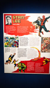
And then there’s Ditko. The exhibit notes call him “Shy Steve Ditko” — Stan’s nickname for an artist who avoided the spotlight so completely that for years only a handful of public photos existed. What Ditko brought to Spider-Man was something few people talk about enough: he drew Peter Parker as a gangly teenager, not a buff overgrown adult. His deceptively simple line work captured emotional turmoil in a way that felt true rather than heroic. He drew insecurity. He drew the weight of secrets. That was radical for superhero comics in 1962, and honestly still is.
“Ditko didn’t draw a hero. He drew a kid who wanted to be one. That’s the whole character.”
The exhibit also tells you something I had never fully processed: many of Peter Parker’s details were drawn from Ditko’s own life. Forest Hills High. The shy outsider who didn’t fit. The overachiever with too much to carry. Spider-Man wasn’t just a creation — it was autobiography in spandex.
The original art. In person. Behind glass. Lord help me.
Okay, this is where I had to consciously breathe.
What’s on display here isn’t reproductions. These are original pencil-and-ink pages — Bristol board — that were working documents. They have handwritten notes at the top. Issue numbers written in pencil. Fingerprints of history in the margins. Seeing Steve Ditko’s final page from Amazing Spider-Man #10, on loan from the collection of Charles Costas, is something that cannot be replicated by a digital file or a hardcover collection. You feel the scale of it. You understand, physically, that a person sat down and drew this in 1963.
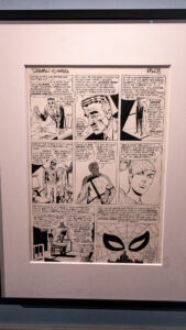
Amazing Spider-Man #10, final page — Steve Ditko, pencil and ink on Bristol board, 1963. From the collection of Charles Costas.
But before we even get to the pages, there’s a display case right at the beginning of the exhibit that set the whole tone for me. And it’s not a comic. It’s a camera.
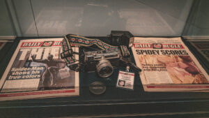
Peter Parker’s world in a glass case — a Yashica camera, his Daily Bugle press badge, and front pages from J. Jonah Jameson’s paper. The camera strap alone is doing so much.
A Yashica film camera with the most beautiful woven strap. Peter Parker’s Daily Bugle News Media press badge — Photographer, No. 8001 — his face small and serious in the ID photo. Two Daily Bugle front pages laid out beneath it: one calling Spider-Man a thief, one with “Spidey Scores” above a photo of Spidey kissing MJ upside-down. This is the whole dramatic irony of the character in a single display case. The kid behind the lens is the same kid in the photo. The paper that employs him hates his alter ego. He keeps the secret, keeps shooting, keeps showing up.
For those of us who are photographers — who know what it means to carry a camera as both a shield and an entry point into the world — this case hits on a different frequency. Peter Parker wasn’t just a superhero who happened to take photos. He was a photographer first. The camera was how he moved through the world before the spider bite. It’s still how he sees it after.
That page features J. Jonah Jameson’s famous soliloquy — the one where he finally admits that he doesn’t hate Spider-Man because Spidey is a criminal. He hates him because he’s jealous. Because Spidey is brave and selfless and Jameson can never be that. It is one of the most psychologically honest moments in 1960s mainstream comics and it’s right there, the original art, taking up a whole wall.
The original splash page from Amazing Spider-Man #64 — “The Vulture’s Prey,” drawn by John Romita Sr. in 1968 — is also there, and it shows you exactly why Romita became the character-defining artist he did. The composition is dynamic without being chaotic. Spider-Man crouches on a ledge, a massive shadow of the Vulture sweeping across the city below. It’s cinematic before cinema was doing this well.
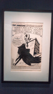
The Amazing Spider-Man #64, splash page — “The Vulture’s Prey.” John Romita Sr., 1968.
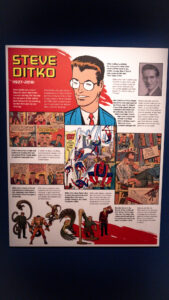
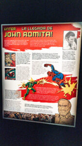
Enter John Romita — and the section that convinced me this exhibit understands craft
The John Romita Sr. wall. Required reading for anyone who loves visual storytelling.
The “Enter John Romita!” section of the exhibit is genuinely great for anyone who cares about how creative transitions happen in collaborative art. When Ditko left Amazing Spider-Man after issue #38, fandom was shaken. Romita — known primarily as a romance comics artist — came in under enormous pressure. His debut issue had to resolve a months-long cliffhanger about the Green Goblin’s secret identity.
What the exhibit does beautifully is contextualize what Romita brought: as Peter Parker aged from teenager to young adult, Ditko’s awkward linework gave way to Romita’s more conventionally attractive characters. The story grew up alongside its readers. And Stan Lee — always the instinctive collaborator — leaned into Romita’s strengths, accentuating the melodrama and social relevance that made Amazing Spider-Man a favorite on college campuses. The book was being read by people who were marching in the streets. That mattered.
The Marvel Method — and the page that almost didn’t survive
Here’s a detail that made me put my phone away and just stand there: the exhibit displays Stan Lee’s actual typed dialogue script for Amazing Spider-Man #82 (1969), along with the finished splash page by John Romita Sr. that it produced.
The placard explains something most people don’t know: Stan Lee didn’t write full scripts. He used what became known as the “Marvel Method” — typing a short story synopsis or just talking through the issue’s main beats with his artist, then letting the artist figure out the panel-by-panel storytelling, determine the sequence of events, and decide what moments to draw. Only after seeing the finished art would Lee write the actual dialogue.
This script — possibly the only surviving example of a Lee dialogue script from his years on Amazing Spider-Man — was preserved by John Romita Sr. and recently rediscovered. It is miraculous that it exists at all. And what it shows you is a working creative process: a partnership between writer and artist in which both parties are genuinely co-authors. The artist isn’t illustrating someone else’s vision. They’re building it together.
The finished page is right next to the script, signed by Romita. “And Then Came Electro!” — and there’s Peter Parker, head in his hands, surrounded by thought bubbles: Harry Osborn, Gwen Stacy, his debts, his secrets, Jonah Jameson, Flash Thompson. A man drowning in his own interior life before the action even begins. It’s a masterclass in a single page.
Side note: there’s a handwritten note in the script to the letterer that says Stan was trying to use fewer exclamation points in this issue, and wanted the letterer to default to periods instead for a classier look. I cannot explain why this made me love Stan Lee more. It just did.
The villains. Because you cannot have Spider-Man without them.
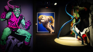
The villain gallery. That’s a real Doc Ock tentacle prop in the center. Green Goblin and Rhino flanking it. The lighting in this room is doing serious work.
There’s a whole room devoted to Spidey’s rogues gallery and I want to be real with you: it’s one of the most visually striking spaces in the entire exhibit. The Green Goblin stands life-size on the left wall — that pink-and-green color scheme that should not work and somehow absolutely does, all crouching menace and angular design. John Romita Sr.’s Rhino takes up a framed print in the background, massive and lumbering, rendered in that distinctive Romita linework that makes even a guy in a rhino suit feel like a genuine threat.
And then, center of the room, in its own spotlight on the floor: a full-scale Doctor Octopus mechanical tentacle. Curved chrome and blue, coiling up out of nothing, lit from below. It’s theatrical in the best way — a museum prop that knows it’s a museum prop and plays it to the hilt. I watched multiple groups of people stop mid-sentence when they walked into this room. That’s good curation. That’s understanding that an exhibit about a superhero needs to make you feel the stakes, not just read about them.
The villains section also quietly reinforces something the whole exhibit keeps returning to: Spider-Man’s enemies are mirrors. The Green Goblin is what happens when genius and power aren’t grounded in responsibility. Doc Ock is the scientist who let his work consume his humanity. The Vulture is the man who feels the world left him behind. Every one of them is a version of Peter Parker who made different choices.
“Stan Takes a Stand” — this is the section that matters most to us
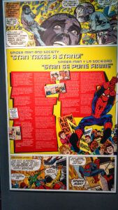
“Spider-Man and Society: Stan Takes a Stand” — the section where comics got loud.
At Shots by Shinobi, we have always believed that art is one of the most powerful tools we have. Not because art is propaganda, but because it captures what official channels refuse to hold. The “Stan Takes a Stand” section of this exhibit is the room that makes that case most directly — and it uses the actual history of Spider-Man to do it.
In 1971, the U.S. Department of Health asked Marvel to publish an anti-drug storyline. Marvel agreed and wrote a three-issue arc in which Harry Osborn overdoses on pills. Then the Comics Code Authority stepped in and refused approval — because their guidelines prohibited any mention of drugs, even in an anti-drug context. Stan Lee published it anyway. The New York Times covered it. The CCA, embarrassed by the coverage, updated their policies shortly after.
The exhibit also covers Spider-Man’s campus protest storyline, his coverage of a prison riot, his confrontation with a corrupt politician. Comics were being read on the same campuses where students were marching against the Vietnam War, demanding civil rights, challenging institutions. Amazing Spider-Man #68 — displayed here as both an original cover color guide and a stunning Romita cover — depicted Spider-Man leaping over a crowd of protesters. “Crisis on Campus!” It was a mainstream superhero comic engaging with the political reality of 1969 because its creators thought it had a responsibility to.
The exhibit is careful to note that this didn’t make Lee a radical. He wasn’t trying to start fires. But he believed that comics that only lived in fantasy had no business pretending to connect to real readers. The “world outside your window” was a phrase he used — the idea that Marvel’s New York should feel like the New York people actually lived in, with all its mess and contradictions. That philosophy is why Spider-Man still resonates. It’s not because of the powers. It’s because of the weight.
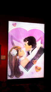
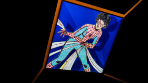
Mary Jane, Gwen, and a Black fashion icon’s forgotten contribution
The exhibit’s section on Spider-Man’s love interests has a moment that stopped me completely. Tucked among the panels featuring Gwen Stacy and Mary Jane Watson — including a large illuminated display of the iconic bridge scene, and a gorgeous illustrated spread of Peter and MJ’s wedding — is a single framed sketch.
It’s labeled: “Design for MJ’s Wedding Gown.” Signed: Willi Smith.
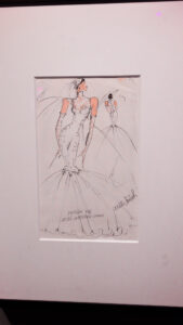
Original sketch for Mary Jane Watson’s wedding dress — Willi Smith, pencil and ink on paper, 1987. From the collection of Mike Burkey.
If you don’t know Willi Smith — and the exhibit’s placard acknowledges that many won’t — he was one of the most celebrated Black American fashion designers of the 1980s, a pioneer of the “street couture” aesthetic who made affordable, democratic fashion that was still genuinely innovative. He died in 1987 at 39, at the height of his career. That same year, Marvel commissioned him to design Mary Jane Watson’s real-world wedding gown for Peter and MJ’s actual wedding issue.
This is the kind of thing that gets lost in the margin notes of pop culture history. A Black fashion legend designed the most famous fictional wedding dress in Marvel Comics in the year he died, and most Spider-Man histories don’t even mention it. The fact that this exhibit found that detail, framed it, and put it on the wall? That’s curatorial care. That’s understanding that the history of a character like Spider-Man is also a history of who contributed to it and got credited — and who didn’t.
The black costume era — including the fan who started it all
The Black Costume section — including the story of Randy Schueller, the fan who pitched the original idea in 1982.
The Black Costume section has a detail that most people who love comics know, but that casual fans absolutely don’t: the initial concept came from a fan. In 1982, Marvel ran a contest for aspiring writers and artists. A fan named Randy Schueller submitted a proposal for a new “stealth” costume made from unstable molecules — similar to the Fantastic Four’s suits — that would enhance Spider-Man’s powers. Marvel bought the concept for $220. By the time the costume appeared in the comics, the color scheme had been changed and the origin story was completely different. But the seed was planted by someone who had no professional credits, just an idea and enough belief in it to write it down.
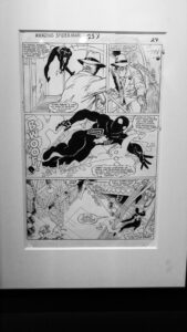
Amazing Spider-Man #253, page 27 — the black costume in action. Original art.
The original art page from Amazing Spider-Man #253 hanging in this section is sharp and kinetic, Spidey in the black suit moving with a different kind of weight than the classic red-and-blue. There’s something about the all-black that reads as vulnerable rather than powerful — no color to hide behind, the character exposed in silhouette. The art makes that feeling real.
Spider-Woman — the section that deserved even more space
The Spider-Woman wall. Three eras of the character, side by side. The Peter Parker Spectacular Spider-Man cover on the left is sending me.
The exhibit dedicates a full wall to Spider-Woman — the evolution of Jessica Drew across decades, from her original 1970s debut through the Brian Michael Bendis and Alex Maleev redesign, to the more recent versions that have made her one of Marvel’s most compelling characters. I’ll be honest: I wanted more. Not because what’s here isn’t good — it’s thorough and well-curated — but because Spider-Woman’s story is genuinely fascinating and deserves a room of its own someday.
Also on this wall: a large illuminated Peter Parker, The Spectacular Spider-Man cover featuring a disco-era scene that is so deeply, perfectly 1978 that I had to stop and appreciate it as a time capsule. Comics absorb the culture they’re made in whether they mean to or not. That cover is evidence.
The inclusion of Spider-Woman — and Ghost-Spider, and the other Spider-people throughout the exhibit — is part of the larger argument the exhibit makes without ever stating it outright: the mask was always meant to be passed. The story was always meant to expand. Every new character who picks up the web-shooter isn’t replacing what came before. They’re proving that what came before was big enough to hold more.
The film props — and the details that wreck you
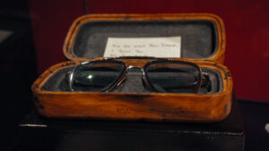
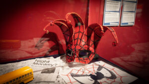
Right: The “Night Monkey” jester mask from Far From Home. Left: Tony Stark’s E.D.I.T.H. glasses in their original case, with a handwritten note inside the lid.
The film props section is where the exhibit shifts gears into something more intimate. Yes, the big suits are there. But the pieces that got me were smaller.
First: the Night Monkey jester mask from Spider-Man: Far From Home. Red and gold, the Spider-Man eye-pattern stamped across a traditional jester silhouette, little bells on each horn. It’s ridiculous. It’s perfect. It’s sitting on a newspaper with the headline “Night Monkey? Man seen jumping from building.” The whole subplot of Peter trying to hide his Spider-Man identity under an alias while in Europe, condensed into this one absurd, beautiful object behind glass.
Then: Tony Stark’s glasses. E.D.I.T.H. — Even Dead, I’m The Hero. They’re sitting in a small wooden case, and inside the lid is a handwritten note. I leaned in close to read it. I’m not going to tell you exactly what it says because you should go read it yourself. What I will tell you is that I stood there for a while after. That’s what good props do. They’re not decoration — they’re portals. You look at Tony Stark’s glasses and you feel the weight of the whole MCU mentorship arc without a word of explanation needed.
Miles Morales is the whole point, and I will not be taking questions
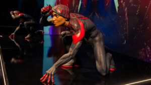
Miles Morales. Life-size. In the flesh. The reflection in the floor is doing everything.
Here’s the thing about this exhibit that got me hardest, and I mean hardest: Miles Morales is centered in a way that feels earned rather than performative. And as a platform whose entire mission is built around amplifying the voices of marginalized and innovative creators, that matters to us deeply.
The Miles statue is breathtaking. He’s crouching low, mask half-pulled back so you can see his face — young, concentrated, the cap still on under the mask like the Brooklyn kid he is. The reflective floor doubles him, his mirror image stretching behind him. The city glows in the display backdrop. It is one of the most carefully designed moments in the entire exhibit, and it deserved to be.
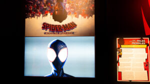
The “Meet Miles Morales” placard on the wall next to it does the thing the whole exhibit does best: it tells you the story straight. Who created him. Why. What his existence in the Spider-Man canon means. Miles didn’t replace Peter Parker. He proved that the mask was never meant for just one person. That is the thesis. That is the whole thing.
“Miles didn’t replace Peter. He expanded what this character could hold. That’s what real representation looks like — it makes room.”
Spidey hits theaters — and the wall explains why it mattered
“Spidey Swings into Theaters!” — from Sam Raimi to the Spider-Verse, it’s all here.
The film section moves quickly but covers everything: Sam Raimi’s 2002 original, the Garfield era, Tom Holland’s three films, No Way Home bringing all three Peters together, and the animated explosion of Into the Spider-Verse and Across the Spider-Verse. It’s a reminder that every generation of Spider-Man fans has a different face they associate with the mask — and that’s a feature, not a bug.
“Spider-Man doesn’t belong to any one era. Every generation gets to find themselves in the mask.”